Stop Collecting Data Nobody Uses: How to Design a Lean, Purposeful MEAL Plan
A practical guide to cutting the bloat from your MEAL system — so field teams collect less and decision-makers use more
There's a pattern I see constantly in humanitarian and development programs: a MEAL plan so packed with indicators, data sources, and reporting columns that nobody — not the field team, not the program manager, not the donor focal point — can tell you what it's actually for.
The plan exists. The data gets collected. And then it sits in a spreadsheet that nobody opens between donor reports.
This isn't a tools problem or a capacity problem. It's a design problem. And it's fixable — if you're willing to be honest about one uncomfortable question: Who is going to use this data point, and for what decision?
Why MEAL Plans Get Bloated in the First Place
The bloat usually comes from good intentions. Teams add indicators to show donors they're being comprehensive. Coordinators copy indicator lists from previous projects. Logical frameworks get finalized under deadline pressure with no one stopping to ask whether a given variable is actually measurable with available resources.
EvalCommunity's MEAL Plan Toolkit [1] — built on standards from USAID, FCDO, and UN agencies — makes an important observation here: effective MEAL systems should ensure "continuous tracking of project activities, outputs, and outcomes to ensure implementation stays on course and identifies issues early." Note what that doesn't say: it doesn't say track everything possible. It says track what keeps the program on course.
That distinction matters enormously in the field, where data collection time is a real cost paid by real people who also have to do the actual program work.
⚠️ Warning: Every indicator you add to a MEAL plan is a commitment — to collect, to clean, to analyse, and to act on. If you can't name who will act on it and how, cut it.
The Core Principle: Every Data Point Needs a Decision Owner
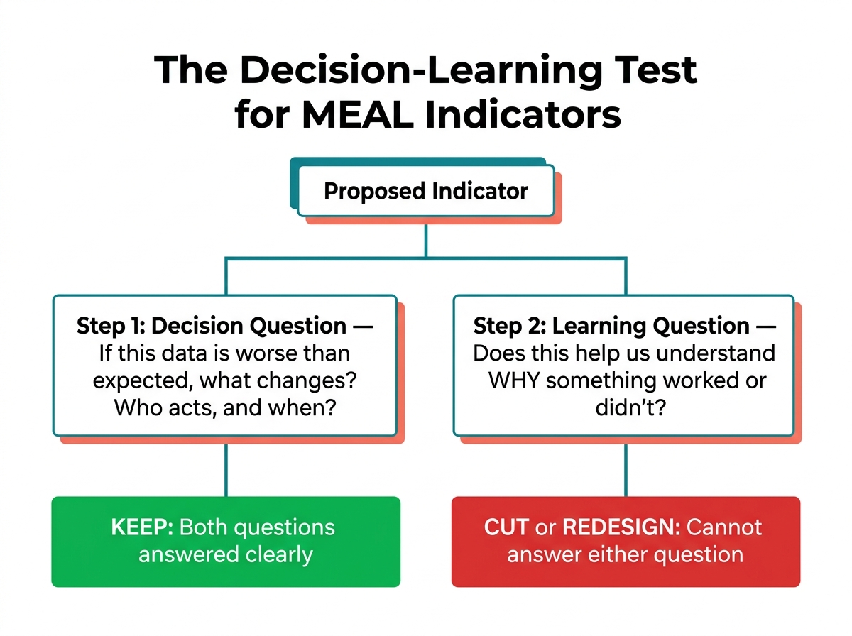
Here's the lens I'd encourage every MEAL officer to apply when reviewing a plan: for each indicator, name the decision it feeds.
ActivityInfo's guide on developing a MEAL plan [2] gives a clean illustration of this in practice. In their example logframe for a refugee livelihoods program, each indicator maps directly and explicitly to a level of result — the strategic objective, the intermediate results, the outputs — and each has a named means of verification. The % of refugees employed indicator exists to answer the strategic question of whether refugees are actually accessing livelihoods. The # of refugees who participate in vocational trainings exists to track output delivery. They're not interchangeable, and neither is redundant.
That kind of disciplicity is harder to maintain in practice than it looks on paper. But it's achievable if you build the MEAL plan backwards from decisions, not forwards from activities.
A Practical Filter: The Decision-Learning Test
Before finalising any indicator or data collection activity, run it through this two-question test:
- Decision question: If this data comes back worse than expected, what changes? Who changes it, and when?
- Learning question: Does this data help you understand why something worked or didn't — in a way that improves future programming?
If the honest answer to both questions is "nothing" or "we're not sure," that's a strong signal the indicator is there for appearances, not utility.
ReliefWeb's MEAL Planning in Practice training [3] introduces a 9-column planning tool that structures this kind of thinking — covering not just what to measure, but how, when, by whom, and critically, how the data will be used. That final column is the one teams usually leave blank. Don't.
💡 Tip: Add a "Decision/Use" column to your indicator matrix. For each row, write one sentence describing the specific program decision this indicator informs. If you can't write it, the indicator probably shouldn't be in the plan.
Qualitative Data Gets the Worst of the Bloat
Quantitative indicators tend to be easier to scrutinise — if you have 47 output indicators, someone will eventually notice. But qualitative data collection is where I see the most aimless accumulation.
KII guides that cover 35 questions when 12 would do. FGD guides that ask about everything because "it might be useful." Open-ended survey questions appended to every questionnaire because someone thought it would add richness.
As Bulus Sule Maina's LinkedIn piece on qualitative data collection in MEAL [4] points out, effective qualitative methods require careful design grounded in specific evaluation questions — not a fishing expedition. Ethical data collection also demands proportionality: you're asking beneficiaries to give their time and share their experiences. That obligation should make you selective.
📝 Note: Qualitative data is not a supplement to add depth — it's a methodology to answer specific questions that numbers can't. Design it that way.
What a Lean MEAL Plan Actually Looks Like
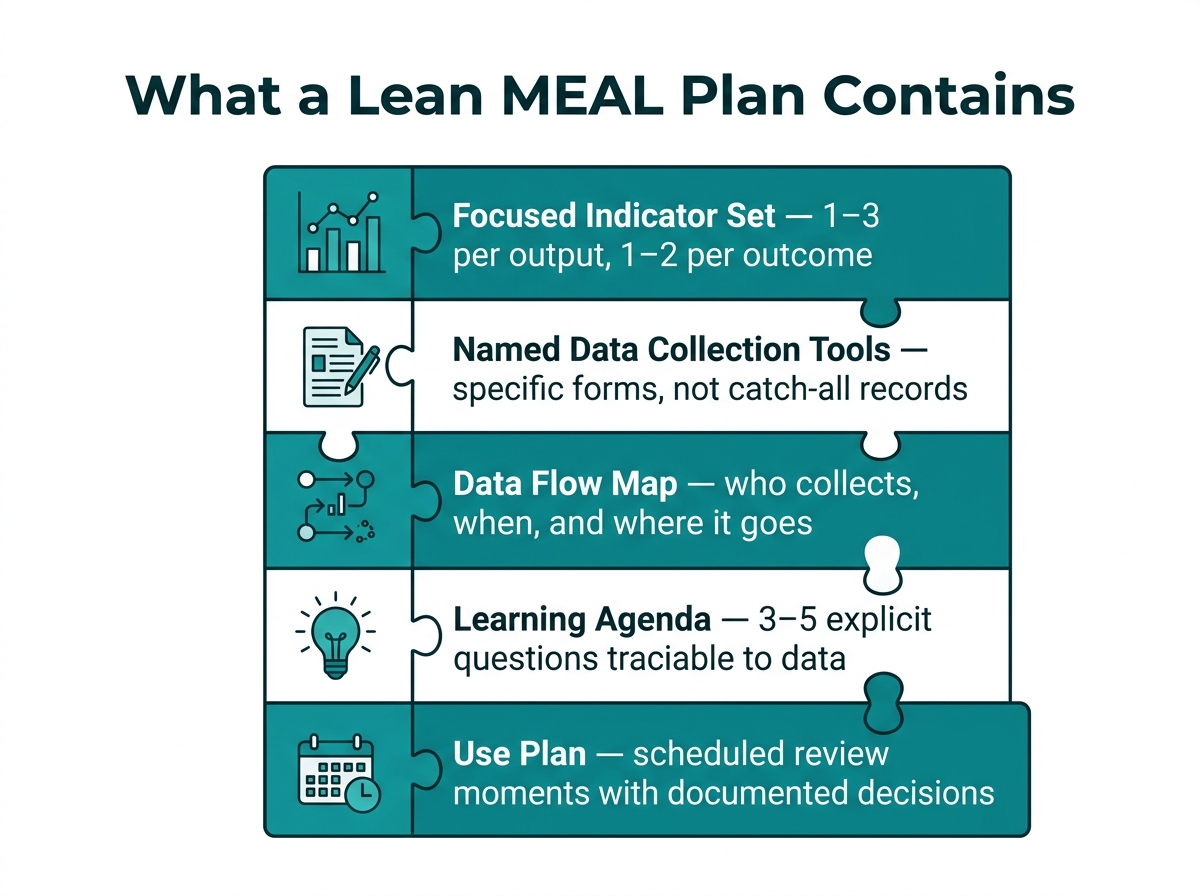
A lean MEAL plan isn't a short MEAL plan — it's a purposeful one. Here's what it has:
- A limited set of indicators per results level — typically 1–3 per output, 1–2 per outcome, 1 per objective. If every output has 6 indicators, something has gone wrong upstream in the logframe design.
- Named data collection tools for each indicator — not "project records" as a catch-all, but the specific form, register, or instrument.
- A data flow map — who collects what, when, and where it goes before it reaches the person who needs to act on it.
- A learning agenda — 3 to 5 explicit questions the program wants to be able to answer by midterm or endline, with each question traceable back to specific data collection activities.
- A use plan — scheduled review moments (weekly field check-ins, monthly progress reviews, quarterly learning sessions) where data is actually discussed and decisions are documented.
ELD Impact's practitioner-led MEAL training [5] makes a point I agree with strongly: donors don't just want data collection — they want evidence of learning. The teams that stand out are those who can show that their MEAL data changed something — a targeting approach, a service delivery model, a referral pathway.
If your reporting cycle ends with "data collected and reported," you're only halfway there.
If you'd like help turning this into a ready-to-use MEAL plan template — with indicator matrices, a decision-use column, and a learning agenda structure — that's exactly the kind of thing I can build with you at vera.ignex.io.
Making Analysis and Storytelling Part of the System
One reason data goes unused is that analysis isn't built into the plan. It's treated as something that happens at the end — during the evaluation, or when the donor report is due.
A useful reframe, reflected in the MEAL Data Analysis for Effective Learning webinar [6], is to treat data storytelling as a routine function, not a one-time deliverable. What does the data say this month? What's surprising? What do we not yet understand? These questions, asked regularly and deliberately, keep the MEAL system alive and useful between formal reporting moments.
💡 Tip: Schedule a 30-minute "data conversation" into your monthly team meeting — not to present findings, but to ask: What is this data telling us that we haven't acted on yet?
Where to Start This Week
If your current MEAL plan is overstuffed, you don't have to rebuild it from scratch. Start here:
- List every indicator in your current plan.
- For each one, write one sentence describing the decision or learning question it answers.
- Highlight anything where you can't write that sentence. Those are your candidates for cutting, merging, or redesigning.
- Identify your top 3–5 learning questions for the program period.
- Check that your qualitative tools map directly to those questions — and trim anything that doesn't.
A lean, purposeful MEAL plan is not less rigorous than a bloated one. It's more rigorous — because every element in it can be justified, used, and defended. That's the standard worth holding yourself to.
Sources
- MEAL Plan Tool | EvalCommunity
- How to develop a MEAL plan (PDF) - ActivityInfo
- MEAL Planning in Practice 2026 - ReliefWeb
- Effective Qualitative Data Collection for MEAL - LinkedIn
- MEAL Training: Build Skills That Donors Actually Value - ELD Impact
- MEAL Data Analysis for Effective Learning and Story Telling - YouTube
Put this into practice with Vera
Build logframes, indicators, surveys and reports in minutes — with an AI made for MEL.
Try Vera free →